MATHEMATICS IN ARCHITECTURE
Submitted by plusadmin on March 1, 2007
Submitted by plusadmin on March 1, 2007


Mathematics and architecture are related, since, as with other arts, architects use mathematics for several reasons. Apart from the mathematics needed when engineering buildings, architects use geometry: to define the spatial form of a building; from the P
ythagoreans of the sixth century BC onwards, to create forms considered harmonious, and thus to lay out buildings and their surroundings according to mathematical, aesthetic and sometimes religious principles; to decorate buildings with mathematical objects such as tessellations; and to meet environmental goals, such as to minimise wind speeds around the bases of tall buildings.
ythagoreans of the sixth century BC onwards, to create forms considered harmonious, and thus to lay out buildings and their surroundings according to mathematical, aesthetic and sometimes religious principles; to decorate buildings with mathematical objects such as tessellations; and to meet environmental goals, such as to minimise wind speeds around the bases of tall buildings.
In Ancient Egypt, Ancient Greece, India, and the Islamic world, buildings including pyramids, temples, mosques, palaces and mausoleums were laid out with specific proportions for religious reasons. In Islamic architecture, geometric shapes and geometric tiling patterns are used to decorate buildings, both inside and outside. Some Hindu temples have a fractal-like structure where parts resemble the whole, conveying a message about the infinite in Hindu cosmology. In Chinese architecture, the tulou of Fujian province are circular, communal defensive structures. In the twenty-first century, mathematical ornamentation is again being used to cover public buildings.
In Renaissance architecture, symmetry and proportion were deliberately emphasized by architects such as Leon Battista Alberti, Sebastiano Serlio and Andrea Palladio, influenced by Vitruvius's De architectura from Ancient Rome and the arithmetic of the Pythagoreans from Ancient Greece. At the end of the nineteenth century, Vladimir Shukhov in Russia and Antoni Gaudí in Barcelona pioneered the use of hyperboloid structures; in the Sagrada Família, Gaudí also incorporated hyperbolic paraboloids, tessellations, catenary arches, catenoids, helicoids, and ruled surfaces. In the twentieth century, styles such as m9odern architecture and Deconstructivism explored different geometries to achieve desired effects. Minimal surfaces have been exploited in tent-like roof coverings as at Denver International Airport, while Richard Buckminster Fuller pioneered the use of the strong thin-shell structures known as geodesic domes.
Hi
storically, architecture was part of mathematics, and in many periods of the past, the two disciplines were indistinguishable. In the ancient world, mathematicians were architects, whose constructions - the pyramids, ziggurats, temples, stadia, and irrigation projects - we marvel at today. In Classical Greece and ancient Rome, architects were required to also be mathematicians. When the Byzantine emperor Justinian wanted an architect to build the Hagia Sophia as a building that surpassed everything ever built before, he turned to two professors of mathematics (geometers), Isidoros and Anthemius, to do the job.
Apart from the mathematics needed when engineering buildings, architectsuse geometry: to define the spatial form of a building; from the Pythagoreans of the sixth century BC onwards, to create forms considered harmonious, and thus to lay out buildings and their surroundings according to mathematical, aesthetic .
If you understand general geometry and physics you are good; having addition, subtraction, multiplication and sometimes division skills are encouraged. ... Math teaches and develops analytical problem solving skills, at our Gcore architects areproblem solvers
By
Back to the Constructing our lives package
Architecture has in the past done great things for geometry. Together with the need to measure the land they lived on, it was people's need to build their buildings that caused them to first investigate the theory of form and shape. But today, 4500 years after the great pyramids were built in Egypt, what can mathematics do for architecture? At last year's Bridges conference, which explored the connections between maths and art and design, Plus met up with two architects of the Foster + Partners Specialist Modelling Group, Brady Peters and Xavier De Kestelier, to cast a mathematical eye over their work.

The London City Hall on the river Thames. Note the giant helical
stair case inside. Image © Foster + Partners.
stair case inside. Image © Foster + Partners.
Foster + Partners is an internationally renowned studio for architecture led by Norman Foster and a group of senior partners. It has created landmarks like 30 St Mary Axe in London (also known as the Gherkin), London City Hall and the Great Court at the British Museum. Ongoing projects include one of the biggest construction projects on the planet, Beijing International Airport, as well as the courtyard of the Smithsonian Institution in Washington DC and the new Wembley Stadium in London.
Many of Foster + Partners' projects have one thing in common: they are huge. This means maximal impact on their environment and its people. Designing such enormities is a delicate balancing act. A building not only needs to be structurally sound and aesthetically pleasing, it also has to comply with planning regulations, bow to budget constraints, optimally fit its purpose and maximise energy efficiency. The design process boils down to a complex optimisation problem. It's in the way this problem is solved that modern architecture differs most from that of the ancient Egyptians: advanced digital tools can analyse and integrate the bewildering array of constraints to find optimal solutions. Maths describes the shapes of the structures to be built, the physical features that have to be understood and, as the language of computers, forms the basis for every step of the modelling process.
The Specialist Modelling Group
The Foster + Partners Specialist Modelling Group (SMG), of which De Kestelier and Peters are members, was set up in 1997. The SMG's job is to help architects create virtual models of their project. "Usually a team come to us with a concept," says De Kestelier, "that could be anything from a sketch to something already quite developed. We then help them to model it using CAD (computer aided design) tools, or we develop tools for them."

Mathematical surfaces populated with panels. Image courtesy Brady Peters.
With the help of computers you can model pretty much every aspect of a building, from its physics to its appearance. Computer models can simulate the way the wind blows around the building or sound waves bounce around inside it. Graphic programs can explore different mathematical surfaces and populate them with panels of different textures. And all the information you get from these models can be pulled together in what is probably the most important innovation in architectural CAD tools in recent years: parametric modelling.

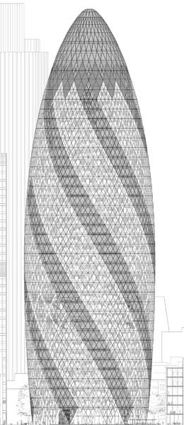
An architect's model of 30 St Mary Axe. Image © Foster + Partners.
Parametric modelling has been around since the 1960s, but only now are architects fully exploiting its power. The models allow you to play around with certain features of a building without having to re-calculate all the other features that are affected by the changes you make. This makes them extremely powerful design tools. Take the Gherkin shown on the left as an example. If you decided to make the building slightly slimmer, this would have a knock-on effect on some other features. You'd have to re-calculate its out-lining curves and the angles of its diamond shapes, for example. This is quite a lot of work and even when it's done, you'd still have to draw a new sketch, either by hand or by re-programming your computer.
Parametric models do all this for you. They allow you to change a variety of geometrical features while keeping fixed those features you have decided should not change. The models function a bit like spreadsheets: changing a feature of the building is like changing an entry of the spreadsheet. In response to a change the software regenerates the model so that pre-determined relationships are maintained, just like a spreadsheet re-calculates all of its entries.
Equipped with the digital tools provided by the SMG, a design team can explore a huge range of design options in a very short period of time. The team can change geometric features of a building and see how the change affects, say, aerodynamic or acoustic properties. They can explore how complex shapes that are hard to build can be broken down into simpler ones, and they can quickly calculate how much material is needed to estimate the cost. The results are buildings that would have been impossible only a few decades ago, both because their complex shapes were next to impossible to construct and because of the degree to which they exploit science to interact optimally with their environment.
The Gherkin
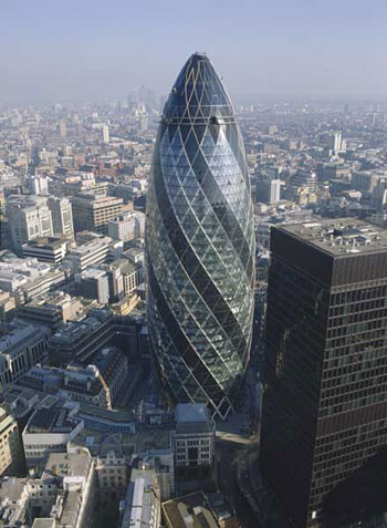
The Gherkin is one of the projects the SMG was involved with and is a prime example of how geometry was chosen to satisfy constraints. Going by the official name of 30 St Mary Axe, the building is 180 metres tall, three times the height of the Niagara Falls. There are three main features that make it stand out from most other sky-scrapers: it's round rather than square, it bulges in the middle and tapers to a thin end towards the top, and it's based on a spiralling design. All these could easily be taken as purely aesthetic features, yet they all cater to specific constraints.
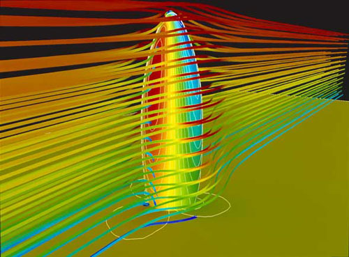
A major problem with buildings of the Gherkin's size is that air currents sweeping around them create whirlwinds at their base, making their immediate vicinity an uncomfortable place to be. To address this problem, the SMG advised the architects to use computer models which, based on the mathematics of turbulence, simulate a building's aerodynamic properties. The model showed that a cylindrical shape responds better to air currents than a square one and reduces whirlwinds. The fact that the tower bulges out in the middle, reaching its maximal diameter at the 16th floor, also helps to minimise winds at its slimmer base.

A model of air currents flowing around the Gherkin. Image © Foster + Partners.
But even if you're not being ruffled by strong winds, standing next to a sky-scraper can be eery. It dwarfs you, it eclipses shorter buildings and it takes away the sunlight. Again, it's the Gherkin's distinctive shape that helps minimise these effects. Its bulging middle and its tapered top ensure that you never see its top from below, thus not making you feel quite as small. And the Sun and other views still have a chance to peep through to the bottom.

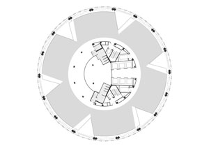
The Gherkin's floor plan. Image © Foster + Partners.
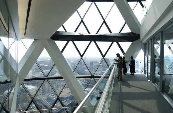
One thing that was decided at the outset was that the Gherkin should be as sustainable a building as possible, and this meant choosing a shape that maximises natural air ventilation (to save on air-conditioning) and the influx of natural sunlight (to save on heating and lighting bills). Six triangular wedges were cut out of the circular plan of each floor, penetrating deep into the building's interior. These serve as light wells, and the shafts they create increase natural ventilation. However, the wedges do not sit right on top of each other. Aerodynamic modelling showed that ventilation is maximised if the plan of one floor is rotated by several degrees with respect to the one below. Thus, the shafts the wedges create spiral up the building and interact optimally with the air currents caused by the building's outward shape. Windows in the facade of the wedges open automatically and draw fresh air into the building. As a result of this carefully chosen geometry, the building reportedly uses 50% less energy than others of comparable size.

The inside of the Gherkin. Triangular wedges have been cut out of its floor plan. They serve as light wells and increase air circulation. Image © Foster + Partners.
The London City Hall
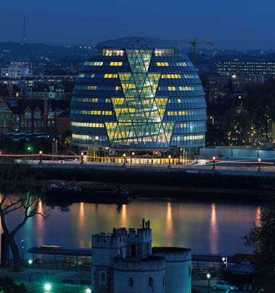
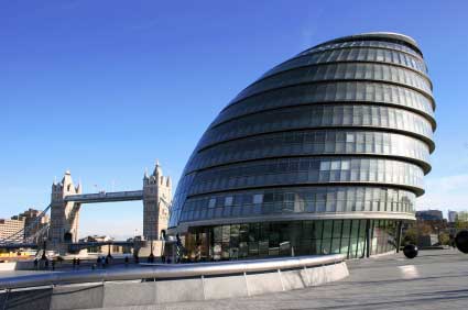
The London City Hall houses the Mayor of London, the London Assembly and the Greater London Authority. The use of glass and a giant helical staircase in the interior are supposed to symbolise the transparency and the accessibility of the democratic process. What is most striking when looking from the outside, though, is the building's odd shape.

The London City Hall on the river Thames.
Perched on the banks of the river Thames, the building is reminiscent of a river pebble, with its roundness again hinting at the democratic ideal. But as with the Gherkin, the shape was not only chosen for its looks, but also to maximise energy efficiency. One way of doing this is to minimise the surface area of the building, so that unwanted heat loss or gain can be prevented. As the mathematicians amongst you will know, of all solid shapes, the sphere has the least surface area compared to volume. This is why the London City Hall has a near-spherical shape.
The building's lopsidedness is also conducive to energy efficiency: the overhang on the South side ensures that windows here are shaded by the floor above, thus reducing the need for cooling in the summer. As with the Gherkin, computer modelling showed how air currents move through the building and the geometry within the building was chosen to maximise natural ventilation. In fact, the building does not require any cooling at all and reportedly uses only a quarter of the energy of comparable office spaces.
Even the helical staircase was not chosen for entirely aesthetic reasons. As part of their analysis, the SMG modelled the lobby's acoustics, quite appropriately for a building representing the voice of the people. Initially the acoustics were terrible with echoes bouncing around the large hall. Something was needed to break up the space. One of Foster + Partners' past projects provided a clue: the Reichstag in Berlin also contains a large hall, but in this case it is broken up by a large spiral ramp. The SMG created a model of a similar spiral staircase for the London City Hall and the company Arup Acoustics analysed the acoustics for this new model. As you can see in the animation below, sound is trapped behind the staircase and echoes are reduced, so the idea was adopted in the final design. (Animation © Arup Acoustics.)
The geometry

A view of the Gherkin. Note the flat panels approximating
a curved shape. Image © Foster + Partners.
a curved shape. Image © Foster + Partners.
What makes the Gherkin, the London City Hall and many other Foster + Partners' structures look so modern is the fact that their outer skins are made up of curved surfaces. These are notoriously difficult and hence expensive to produce, so here's a geometer's challenge: how do you best construct them from simpler shapes?
"This is one of our main challenges," says De Kestelier, "in fact 99% of our projects don't contain any curved surfaces at all. [The Gherkin], for example, only has a single curved panel and that's the lens right at the top." The impression of the building being curved is created by approximating the curved surface by a number of flat polygonal panels — the more panels the truer the illusion.
The SMG have become experts at finding such flat panel solutions to describe complicated surfaces. And, as De Kestelier explains, the geometry is often determined by economy: "We tend to use quadilateral panels, because that's more economical. It's cheaper when you cut the material. With triangles you lose quite a lot of material, but not with quadilaterals. It's also nicer visually I think, because with quadilaterals you see less structure." This is illustrated in the London City Hall whose surface consists entirely of quadilateral shapes.
In fact, the London City Hall illustrates beautifully the need to strike a balance between ideal geometrical shapes and buildability: its awkward bulbous shape was dealt with by cutting it into slices. Each of them is a slice of a slightly tilted cone, which can easily be described mathematically and is easy to


No comments:
Post a Comment